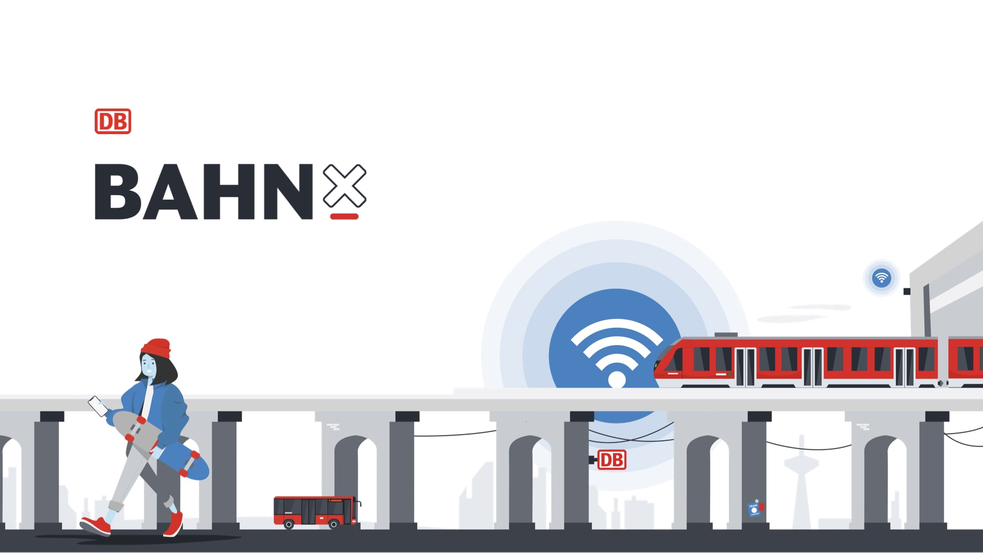
While working with Deutsche Bahn, I was part of a team creating a mobile application, that worked as first mover inside of Deutsche Bahn.
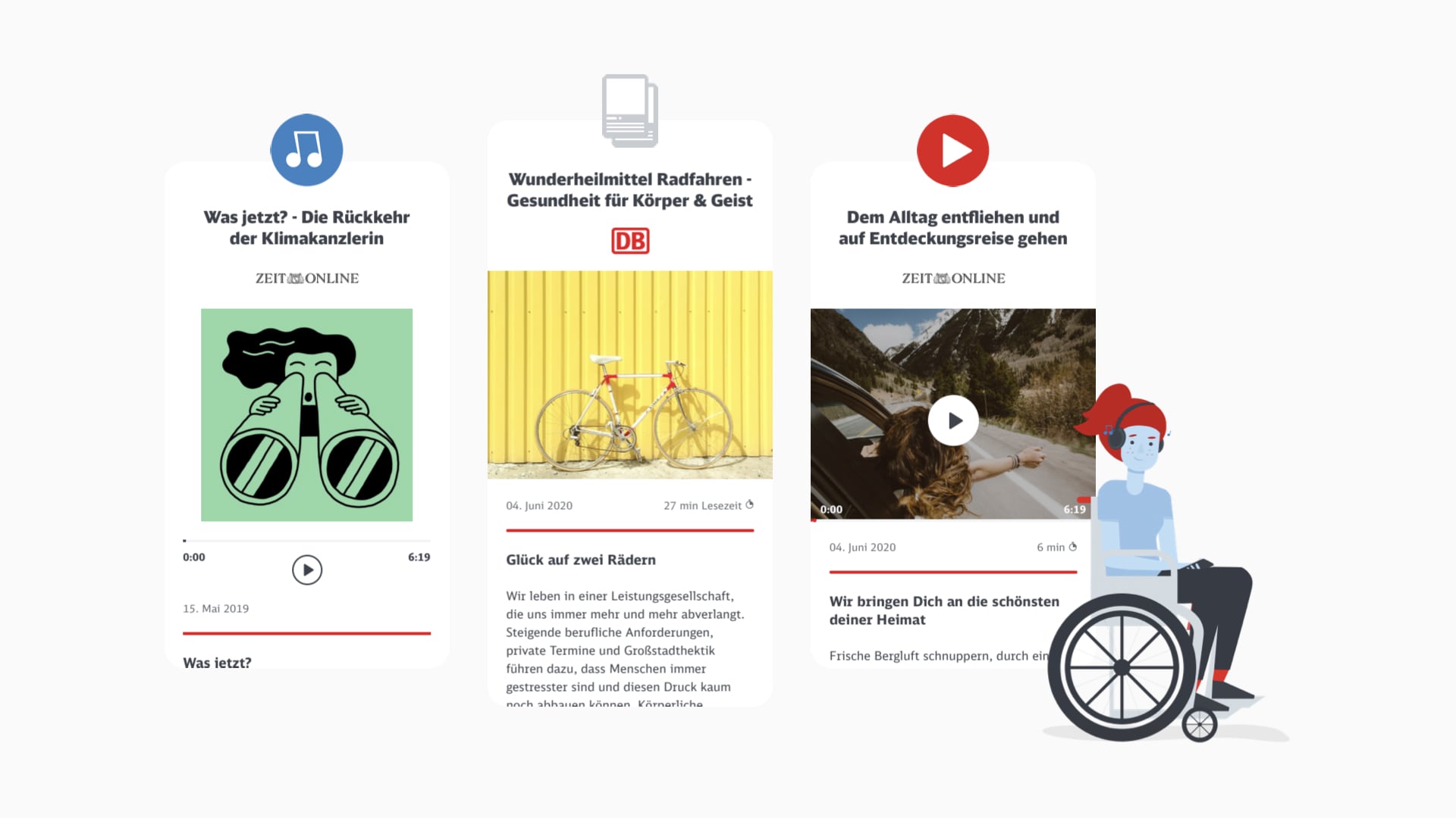
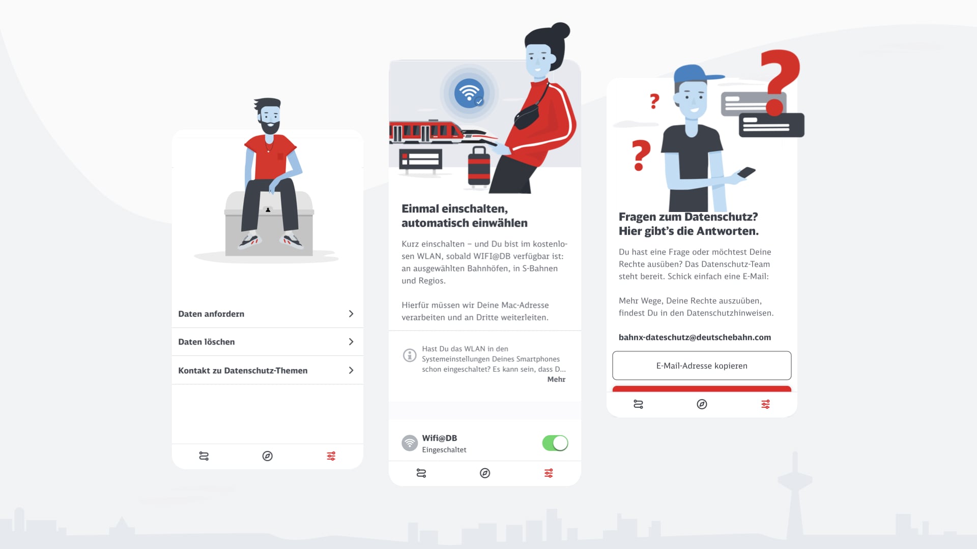
BahnX is a test environment for Deutsche Bahn, which not only tried new functionalities but followed a completely new way of Storytelling. We created a new positioning for the Tone of Voice to communicate from eye to eye and are a pioneer in case of brand look and feel.
We helped to create a new way for digital Deutsche Bahn products and improved the way of traveling with Deutsche Bahn.
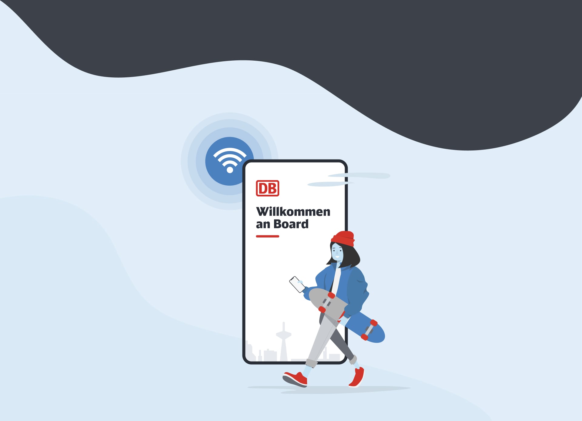
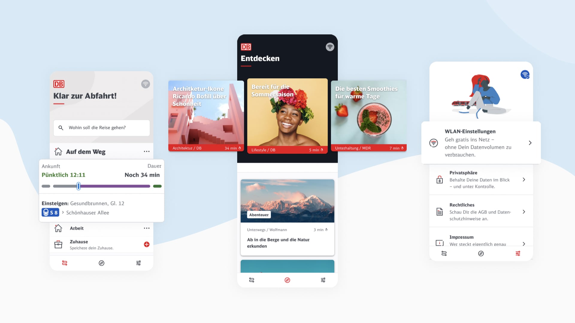
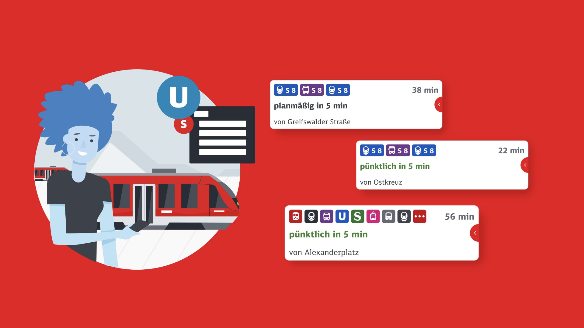
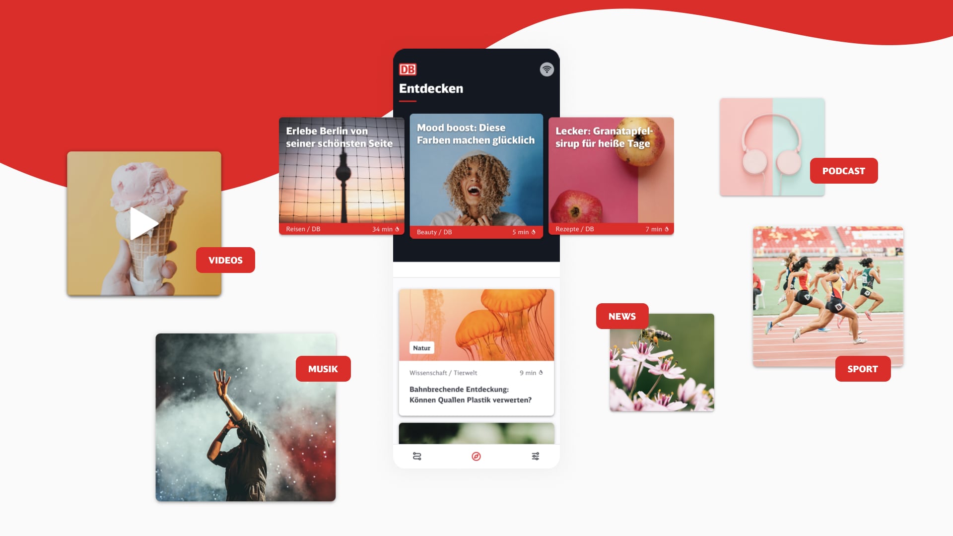
We developed three tabs to make the product easy as possible:
Travel, Discover, Connect.
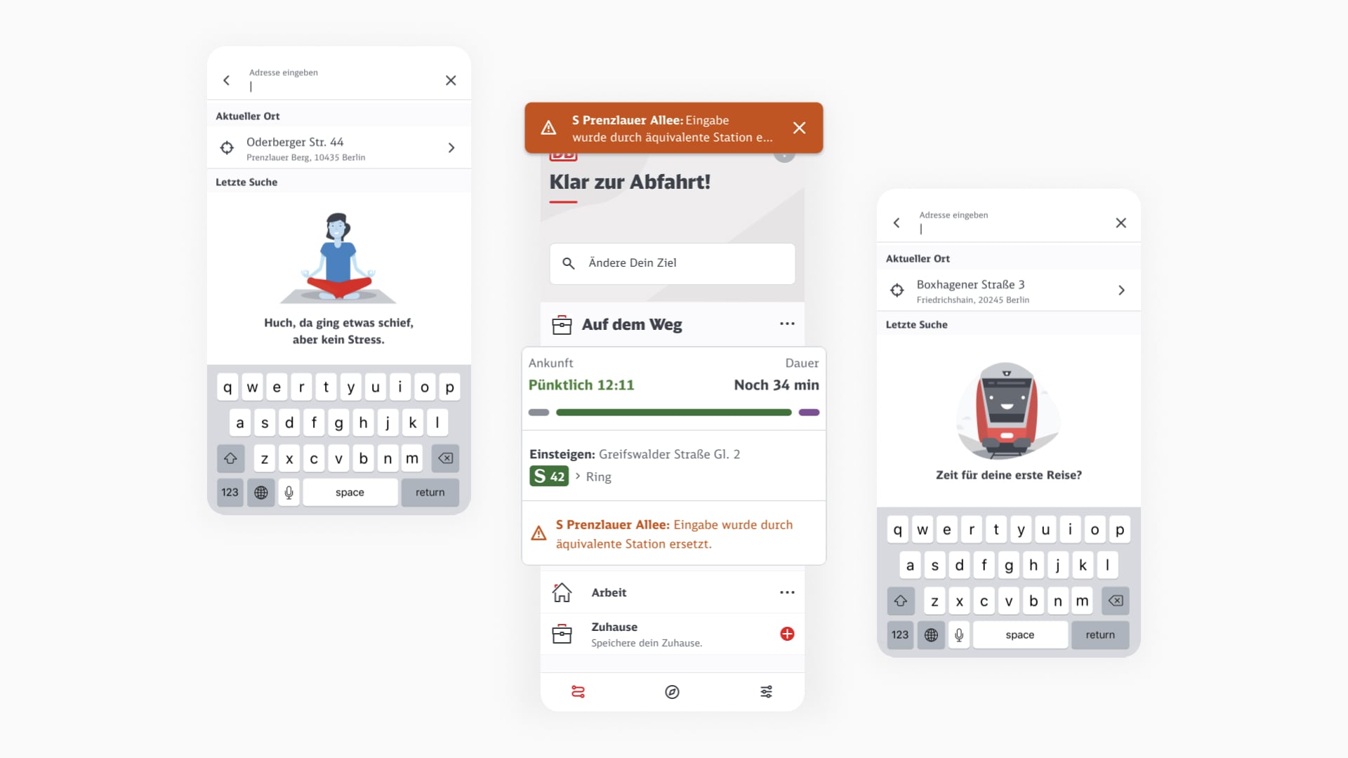
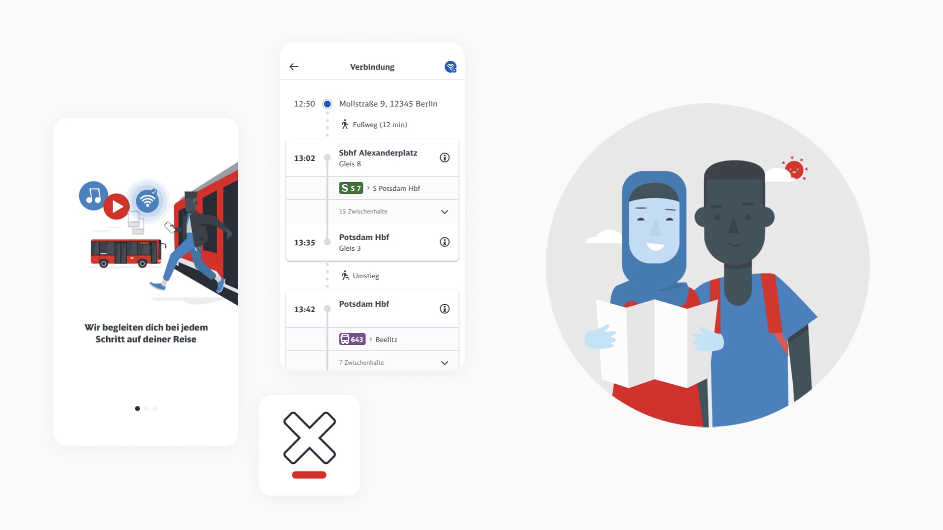
The trains, trams subways and busses of Deutsche Bahn are used by different personalities and nationalities from all over the world.
Our approach was to make the application as accessible as possible for everyone using it.


CLIENT
Deutsche Bahn AG
PROJECT
WIFl@DB
UX-/UI-DESIGN TEAM
Paul Watmough — Lead UI & Brand / Experience Designer
Rui Gorgulho — Lead UX / Experience Designer
Hertje Brodersen — Lead UX / Experience Designer
Julian Knappe — UI / Experience Designer
Valentin Schmidt — UI / Experience Designer
Helena Rott — UX / Experience Designer
Florian Kanzler — UX / Experience Designer
Annika Hüllebrand — Copywriter
Julian Knappe-Wunsch
Sickerkoppel 6
22395 Hamburg
hello@julianknappe.de
© 2026 Julian Knappe | All Rights Reserved | Imprint
