
Protun Solutions
Protun Solutions is a new startup operating in project and supply chain management, as well as global sourcing.
I was tasked to create the brand from the ground up; starting with the name all the way to the corporate design and communication.
My goal was to make Protun Solutions stand out in the crowded market it operates.
The name is a mix of 'project management' and 'tunnelling', referencing the company's area of business while being unique and fresh. It's also the base for the logo, which is based on Quicksand, the new typeface that offers high legibility even on small screens while being distinct enough for large print formats.
Quicksand is also an open-source font, minimizing licensing fees and allowing for corporate-wide use.
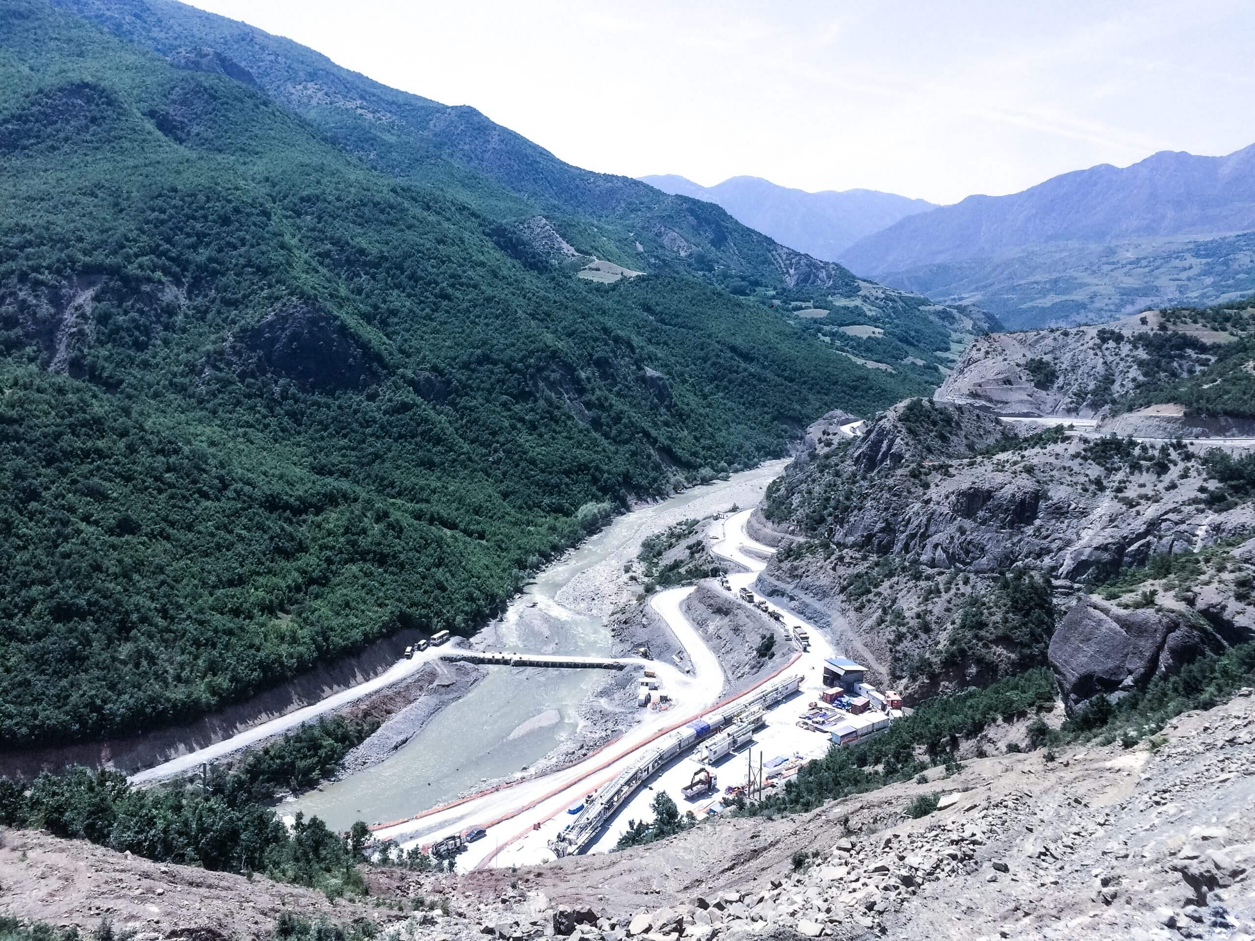
The logo itself can be used in different colour schemes based on its context and use, but is primarily used in dark blue with white as a contrast. The brand colours are shades of blue, keeping the palette clean and focused. For a consistent look and feel, I even created colour graded photographs to keep everything visually aligned.

To highlight the different services, I created a set of custom icons that are playful and pixel-perfect.
To promote the business I designed a simple one-page website - focussing on the services Protun Solutions provides but also offering some background information on the company itself to build trust and offer contact options. The sticky navigation lets the user jump right to the information he seeks and helps him scan the content quickly.

Some website elements were then used to design business cards, flyers, and other printed materials like letters. These synergies helped me to create the brand quickly and efficiently and helped Protun get started right away.


CLIENT
Protun Solutions Inc.
TEAM
Julian Knappe — Experience Designer
Felix S. — Developer
Julian Knappe-Wunsch
Sickerkoppel 6
22395 Hamburg
hello@julianknappe.de
© 2026 Julian Knappe | All Rights Reserved | Imprint